
A brand refresh is critical for all companies, from worldwide organizations to small local businesses. “As businesses grow and change, it’s important for their brands to reflect the current marketplace. Simply put, if you stayed the same while all the companies in your industry changed, adopted fresher logos, and newer ways of communicating with their audience, then you’d end up losing your competitive edge,” explains branding experts at Fabrik.
A brand refresh gives you a chance to evaluate both your customers and the evolving industry. Much could have changed since you last re-branded or first started your company. Updating messaging, brand colors and imagery ensures that you’re appealing to the right audience while remaining competitive in your space.
Use these ideas to give you brand a refresh this spring and step out with a new look that says, “We’re here to stay!”
Update Your Logo
If your logo is as old as your business, this may be the time to give it an update. This is common for brands both big and small, as Carrie Cousins, designer and content marketers hows with the progression of the Starbucks logo:
Re-Think Your Brand Colors
When refreshing your brand colors, it can be helpful to start at the beginning. While you don’t need to make a drastic change, following best practices for choosing colors that will have an impact, while staying true to your brand, is the best way to ensure your refresh is effective.
Adobe recommends starting with a neutral color. This acts as your base: “One-to-two neutral covers will act as the canvas on which you’ll paint.” Neutrals include, black, white, silver, ivory, gray, brown, tan, gold and beige.
Next, choose two colors that will pop against your neutral. This may be a brighter or more stand-out shade of one of your current brand colors. Adobe explains, “This is the color that grabs the attention of your audience and becomes the star of your viual identity.” If you’re looking for inspiration, check out this example:
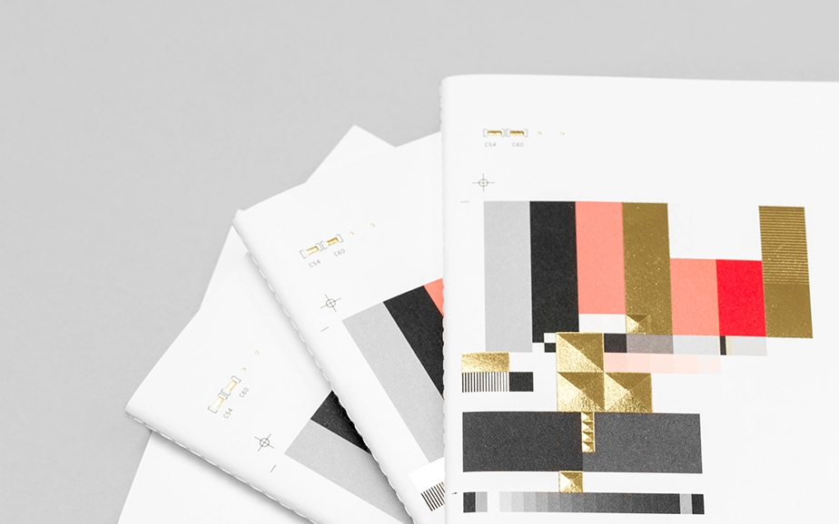
Re-Design Your Print Materials
Print materials are still critical for businesses of all sizes, especially if you attend trade shows and conferences, or simply promote your business around at local coffee shops and stores. Your print materials—from brochures and flyers to banners and business cards—represent your brand, making them critical for your business. A fading flyer with low-quality images will make a bad impression.
If you’re not a design aficionado, use these three tips to update your print materials:
1. Re-think your font: Choosing a font that’s both unique and legible can be challenging, which is why many big brands actually create their own. While there are no hard and fast rules about choosing a font, make sure your font is easy to read and fits with your brand. Choose just one to three complimentary fonts to ensure you have a variety of options that still tie together.
2. Choose the right images: When choosing images, consider both quality (no pixelation, bright colors, easy-to-see), and the Rule of Thirds. Design experts at MyCreativeShop explain in their guide for choosing the best images for your flyer design:
“When considering what photos to use in your flyer, a Rule of Thirds image can naturally create places for you to include important text alongside an amazing image. Images that disobey this rule can leave you struggling to find places to include important text.” See what they mean in their guide below:
Refresh Your Brand This Spring
Give your brand the refresh it needs as the seasons change. Consider how you can make your brand colors pop, your print materials more engaging, and your logo more modern and streamlined. Use these ideas to get started with your brand makeover.